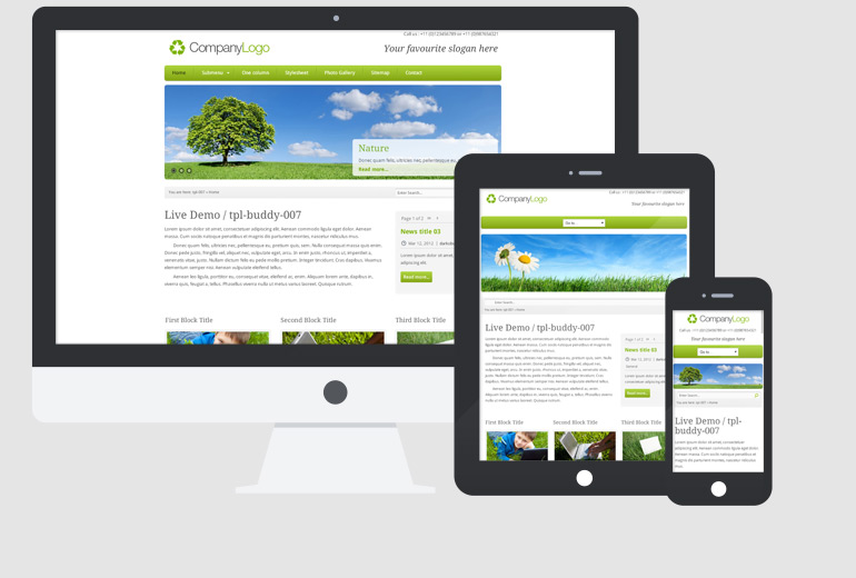
/ 007 /
Full Responsive Template (Theme) for CMS Made Simple
This item is in the update process, currently not available. Thank you.
Requirements
- CMS Made Simple 2.2.14 to be installed (latest recommended).
Server requirements: minimum version of PHP 5.4.11 and the Phar library enabled. Recommended: PHP 7.1 or 7.2.
http://docs.cmsmadesimple.org/installation/
requirements - Module Gallery
- Module FormBuilder
As module GBFilePicker is not available for 2.x we are using {content_image} for choosing images in edit page.
Layout
- 1 or 2 columns, from desktop to tablet and mobile
- Menu: dropdown top (3 levels)
Package contains
- Theme XML file (template, stylesheet, design images, js files)
- Gallery XML files for Slider and Photo gallery
- News Summary and Detail Templates (News title on the title of the page)
- Search Template
- FormBuilder Templates (for main and footer contact forms)
- Instructions - README_FIRST.txt
Important Note
Although we've included most of commonly used features for building a website, there is no template that could cover all possible situations. So feel free to modify this Template to your needs.
* Photos for slider and gallery images in Live Demo are copyrighted material and are not included in the Template package.
Customizable parts / Content page tabs (options)
Please refer to README_FIRST.txt for Installation instructions and Terms of Use.
When you assign the Template to a page, you have several options which controls the page:
Main (tab)
- Content type:
- Content (default)
- Title
- This is a main browsers title in a page. You should type in most significant keywords, for good SEO.
- Menu text
- Text for how the page will show in menus.
- Parent
- If you want the page to be a children of another page, here you set its parent.
- Content*
- This is a main content block on a page (required).
- Main Page Title:
- This is actual title that will show on a page frontend - h2 tag.
- Display Breadcrumbs
- Set '+' to show or '-' to hide Breadcrumbs. Default is '+' i.e. displayed.
- Display Search
- Set '+' to show or '-' to hide Search. Default is '+' i.e. displayed.
Header (tab)
- Display Header Slider
- Set '+' to show or '-' to hide Header Slideshow. Default is '-' i.e. hidden.
- Gallery Module foldername for Header Slideshow
- You have to put a name that you have set in Gallery Module as a slider gallery.
- Top Right text block
- Text line to show at the top right corner, suitable for telephone number or so.
- Company slogan:
- This block appears just below the logo (to delete it just leave it empty)
Sidebar (tab)
- Display Sidebar
- Set '+' to show or '-' to hide Sidebar (1 column page). Default is '+' i.e. displayed.
- Display News
- Set '+' to show or '-' to hide News. Default is '+' i.e. displayed.
- Sliding News on/off
- Set '+' to activate or '-' to turn off News sliding effect. Default is '+' i.e. activated.
- Sidebar Title
- This is a title which appears above sidebar content block.
- Sidebar content block
- Sidebar block which appears below News block. It is not reuqired, if left empty it will not show on a page.
Three Blocks Content (tab)
- Display Three Blocks
- Set '+' to show or '-' to hide Three Blocks content. Default is '+' i.e. displayed.
First Block/Second Block/Third Block (same options for each block)
- First Block Title
- Title of the block
- First Block Image
- Upload your image here. For best fit use 290px image width.
- First Block Content
- Content for the first block
- More Link (label)
- Label for the More link. Default is 'More details..'
- More Link (hyperlink).
- Actual hyperlink for a More link button.
Special box (tab)
- Display Special Box
- Set '+' to display or '-' to hide Special Box. Default is '+' i.e. displayed.
- Special Box Title
- Put here title for Special box
- Special Box content
- Write some content here to show in the Special box container.
Footer (tab)
- Footer First Block Title
- Set title for the footer first block. In live demo its 'Site Links'.
- Display Footer Menu
- Set '+' to display or '-' to hide Footer Menu. Default is '+' i.e. displayed.
- Footer First Block
- Content for the footer first block, which appears below footer menu.
- Footer Second Block Title
- Set title for the footer second block.
- Footer Second Block
- Content for the footer second block.
- Display Footer Gallery
- Set '+' to display or '-' to hide Footer Gallery. Default is '-' i.e. hidden.
- Gallery Module foldername for Footer Gallery
- You have to put a name that you have set in Gallery Module to show as a footer gallery.
- Footer Third Block Title
- Set title for the footer third block.
- Display Footer Contact Form
- Set '+' to display or '-' to hide Footer Contact Form. Default is '+' i.e. displayed.
- Footer Third Block
- Content for the footer third block, which appears above contact form.
Options (tab)
Standard CMSMS options tab, where you set page-alias, metadata etc. Here you set template for this page, which should already be set to buddy007-Default as per installation instructions.